you copy text. you move your mouse to where you want it.
then you have to lift your hand off the mouse, reach ten inches across your desk, hunt for ⌘v, hit it, and move your hand back to the mouse.
it takes two seconds. you do it a hundred times a day. it breaks your focus every single time.
i built here to stop doing that.
double right-click. your clips appear right at your cursor.
click once. it pastes. it vanishes.
your hand never leaves the mouse.
present vs here
the app worked. then came the argument over the name.
i wanted "present".
not for grammar. for shiva's third eye. the eye that only sees what is happening right now. no past regrets. no future anxiety. to me, that was the product.
we tested both from first principles.
why present failed:
- people think of keynote slides and pitch decks.
- mac developers think of
viewcontroller.present(). - people pause to pronounce it: pre-sent or pri-zent? if you have to pause, the name is dead.
why here won:
- your cursor is already sitting on the input box.
- you don't say "make my clipboard present".
- you point and say "paste it here".
- one syllable. clean. zero friction.
why the third eye is here
i was right about the third eye. i was just wrong about the name.
two physical eyes:
- one looks down at the keyboard.
- one looks up at the screen.
- hands jump between mouse and keys. attention breaks.
the third eye:
- doesn't jump.
- opens right where your cursor is.
- collapses the distance between copy and paste.
- pure presence. that is here.
the icon: getting it wrong until it was right
making this icon was painful. one wrong move and it looks like a religious poster. another wrong move and it looks like a creepy eyeball peeping through a door.
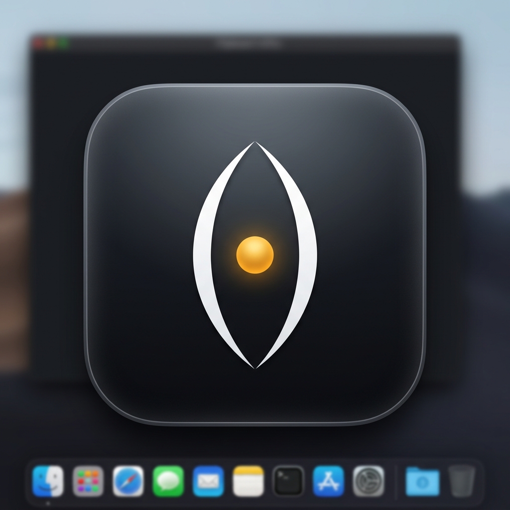
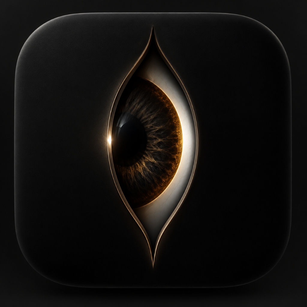
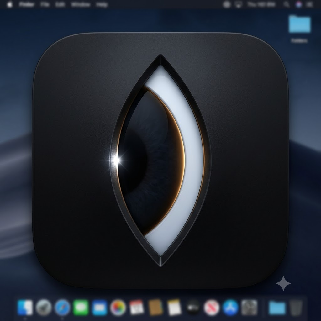
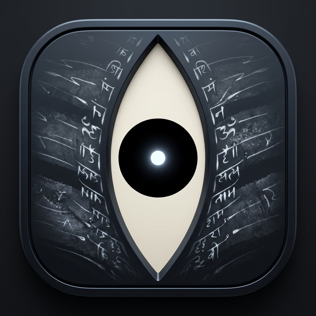
here are the original logo iterations we built and tested:


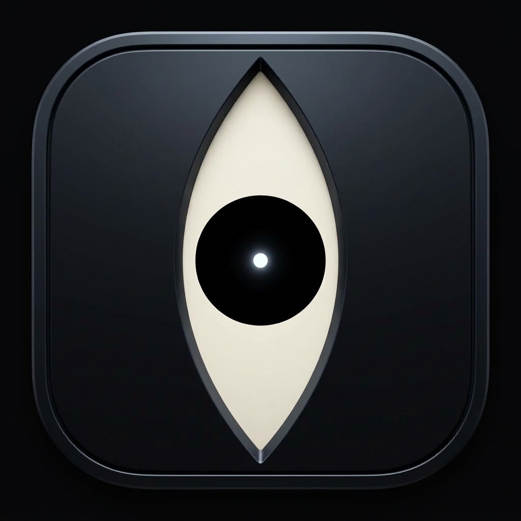
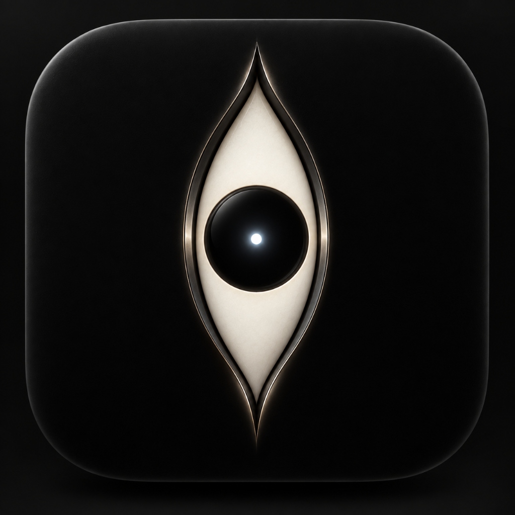
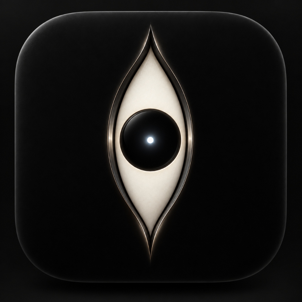
v1: the cold math
two white curved lines on black with an amber dot. clean and mathematical. the problem: cold. felt like a geometry homework problem. no soul.
v2: "is it there or not?"
we made the lines look like twin flames of ash. black circle with an eclipse ring. i looked at it and said:
"i cannot get the feel of it because i don't know it is there but it is not there also."
the ends were open. your brain couldn't decide if it was an eye or two flames. if people have to squint to figure out your icon, you failed.
v3: the overcorrection (clutter)
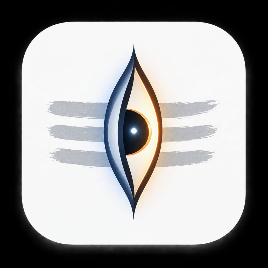
we sealed the tips. we added three horizontal lines of sacred ash (tripundra). we gave it a detailed amber eyeball. it solved the shape, but created two new problems:
- the ash lines made it look like a hindu devotional app. this is a mac tool for the world, not a temple poster.
- the detailed amber eyeball looked biological. at 64px in the dock, it looked like a monster staring at you through a keyhole. creepy.
the turning point (the research)
i went back to an old painting of shiva's eye on stone that i kept saved, alongside my original pinterest research photos.
no veins. no eyelids. no creepy fleshy eyeball. just pure, timeless geometry.
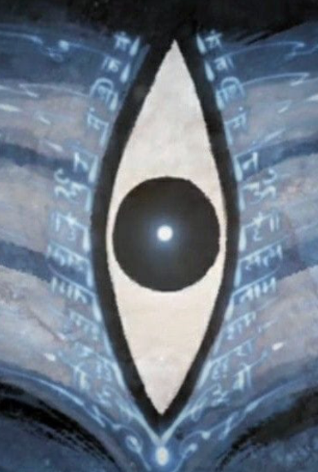
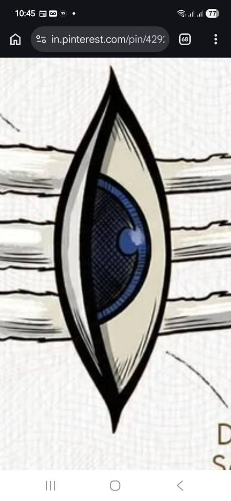
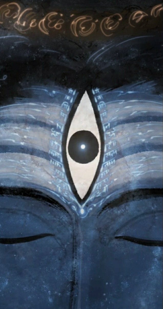
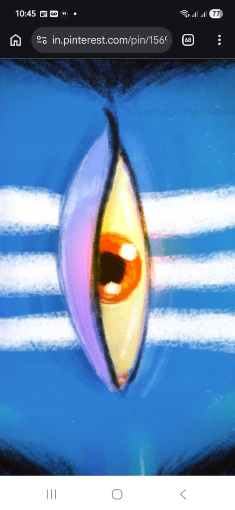

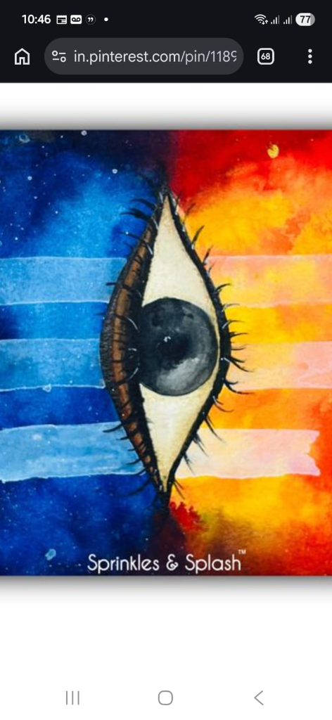
looking at the stone painting, it finally clicked:
- the white dot is your cursor.
- the black circle is your clipboard history.
- the vertical cutout is the menu that opens on double right-click.
- the black squircle is the silence when it closes.
the final mark
we dropped the ash lines. we killed the creepy eyeball. we built the stone painting out of apple materials:
- matte black ceramic squircle.
- titanium bevel catching top light.
- porcelain white bed.
- polished obsidian lens in the center.
- glowing white cursor dot.
not a drawing of an eye. an instrument.
the three rules
- never steal attention.
no badges on the dock. no push alerts. no sounds. silent until you click. - never make the hand jump.
if you have to move your hand to the keyboard to paste, the app failed. - open fast. leave no mess.
double right-click. click. pasted. gone.